Whether it be through freelance work with My Nerdy Web Guy, or personal connections, I am always on the lookout to improve my graphic design skillset and streamline my process.
WHISKEY TURTLE FORGE
Working with the client Whiskey Turtle Forge (W.T.F.) was the first project where the desired logo was something I was not familiar with making. A mascot / e-sports logo that was more of an illustration than a logo. The turtle portion was to be based of an awesome looking turtle species known as the Alligator Snapping Turtle, a very cool and aggressive looking creature that was very fun to draw from.
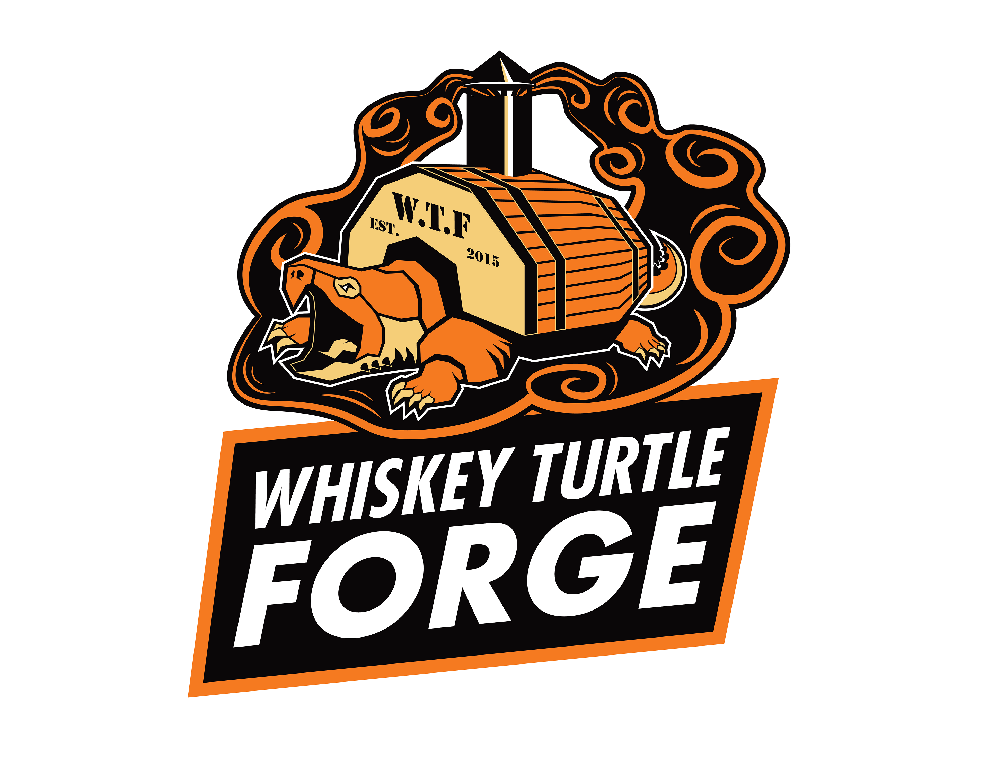
Ultimately, we landed on a design where the turtle carried a forge on its back to be its shell with subtle indications of a whiskey barrel. This was a lot of fun to work on and really tested me to combine graphic design principles with illustration techniques.
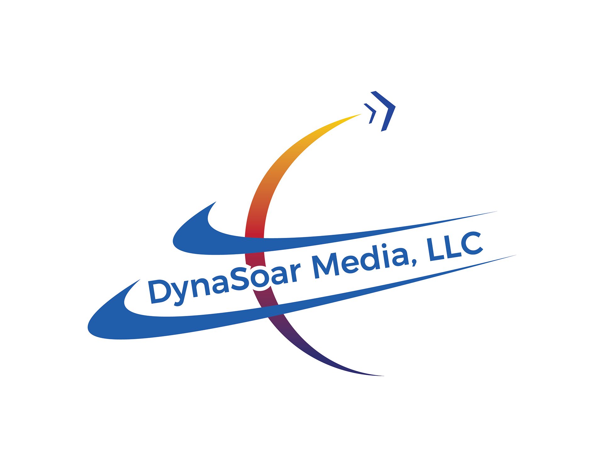
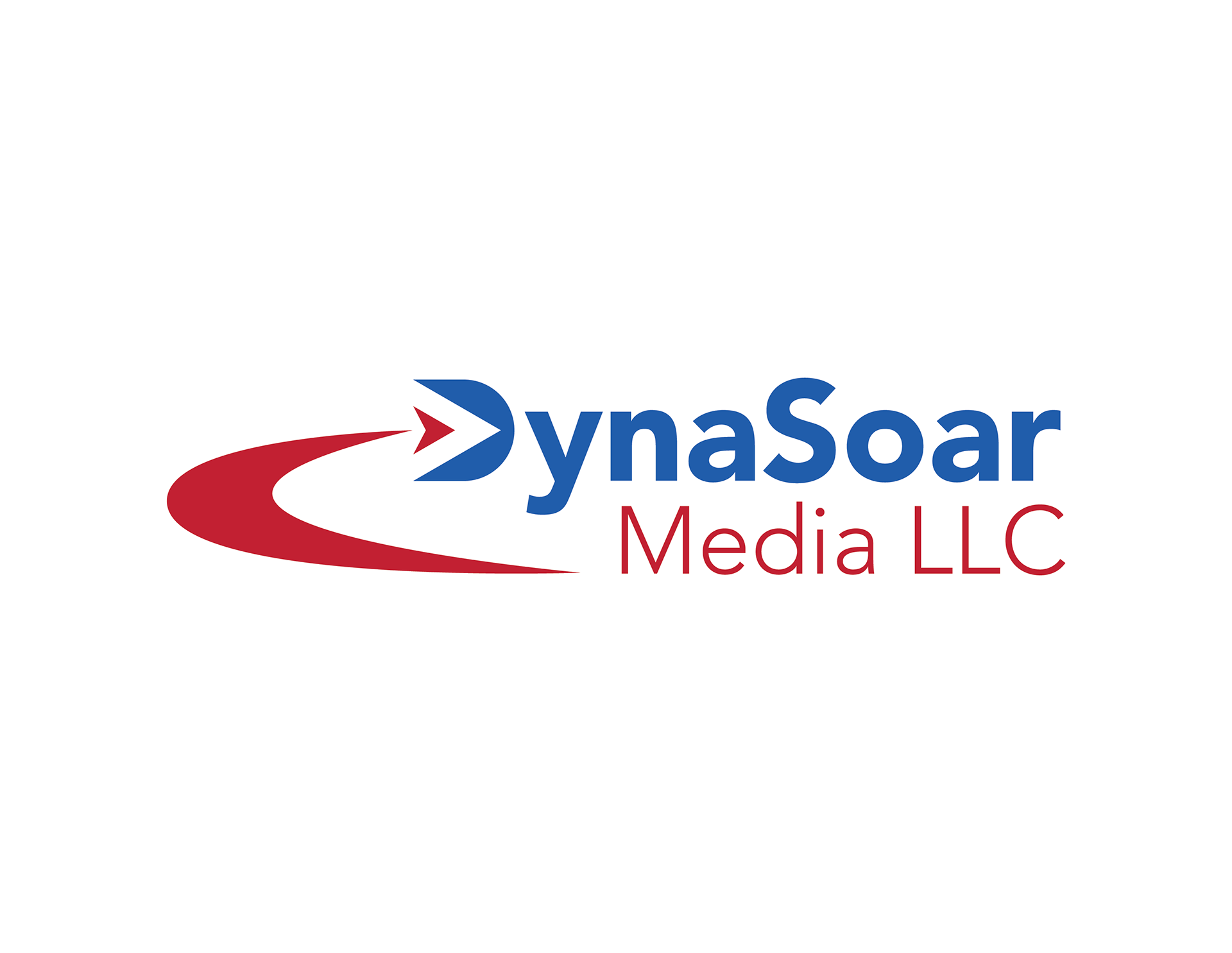
DyNASOAR MEDIA
One of my first freelance jobs was a logo design for the company DynaSoar Media. A media company in Arizona that had been around for a few decades, but definitely needed an updated logo.
Technically the project was to recreate their current logo, that had deteriorated from years of being copy and pasted and the original file location nowhere to be found. The current logo was dated, to put it nicely, but I was still proving myself in the job so I did what I was asked. However I also floated along my version of their logo that I had made on my own time but without any input from the client. They loved my version and that gave me a great confidence boost that I could actually do this.
This was the recreated version of their old logo.
This is my version that is reminiscent of their previous logo with the swoosh and flying arrow incorporated, but applied in an intentional and clean manner.
HUMAN-EQUINE ALLIANCES FOR LEARNING
The Human-Equine Alliances for Learning (or HEAL) approached us because they also needed an updated logo. Their current one was a little outdated but they still wanted to maintain the style of the serif text they had. Their main concern was the shape of the human-horse interaction that they currently had. It wasn't that clear where one figure began and where one ended, but they wanted to keep that idea of a silhouette. So off to the sketchbook I went!
What they had previously.
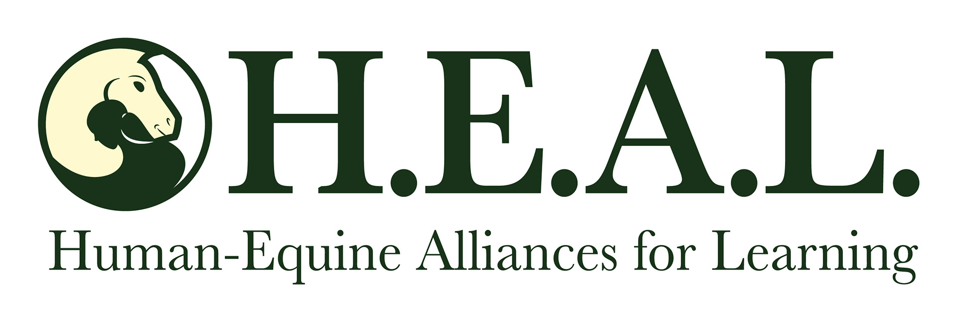
My version right from the start was to have a clear separation. The Yin-Yang symbol was clear in my head as I was designing this. I had also planned for the two subject to be interacting a little more than just gazing into each others eyes. The client was very satisfied and is even going to produce pins of the logo as well.
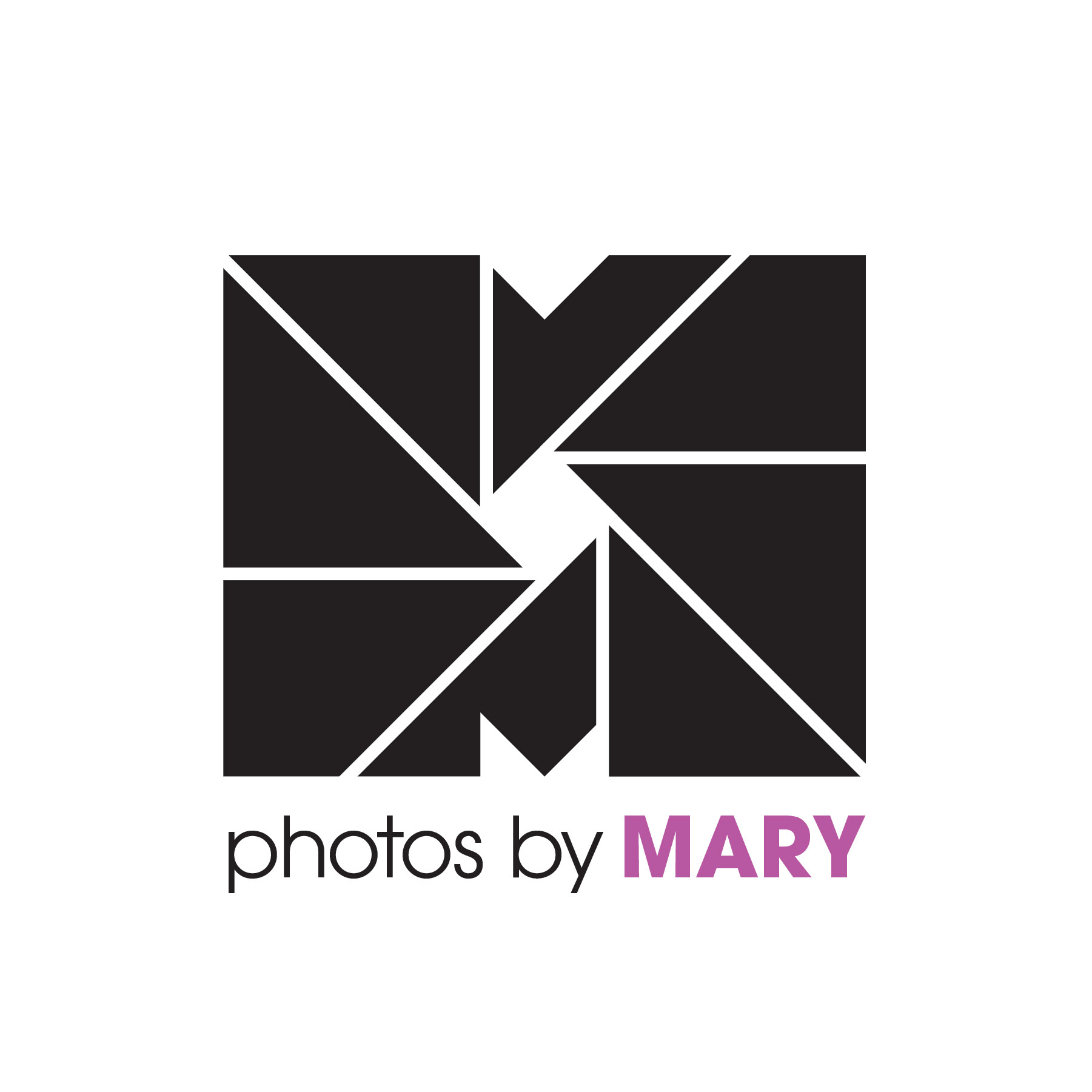
PHotos By MAry
I worked with Mary at our day job, and when she had casually mentioned that she was looking for a logo to promote here photography business, I jumped at the opportunity.
In the brief that I had given her to fill out, one thing she mentioned was that she wanted to evoke a sense of being both approachable and feeling like you could be yourself in the middle of a session. After sifting through countless boring and uninspiring photography logos, I found one that had used the cameras aperture as a design element and immediately thought how cool that looked and wanted to do something similar. To push my logo just a tiny bit further, I also found out what proportion that a Polaroid picture was and used that same ratio to base the logo off of.