
Professionally, I haven't worked in or for a magazine, however, I do believe that it is important to be able to design for one. As a way to practice, I have used an article posted on Elon University's news blog "Today at Elon" and presented it as if it were a magazine article.

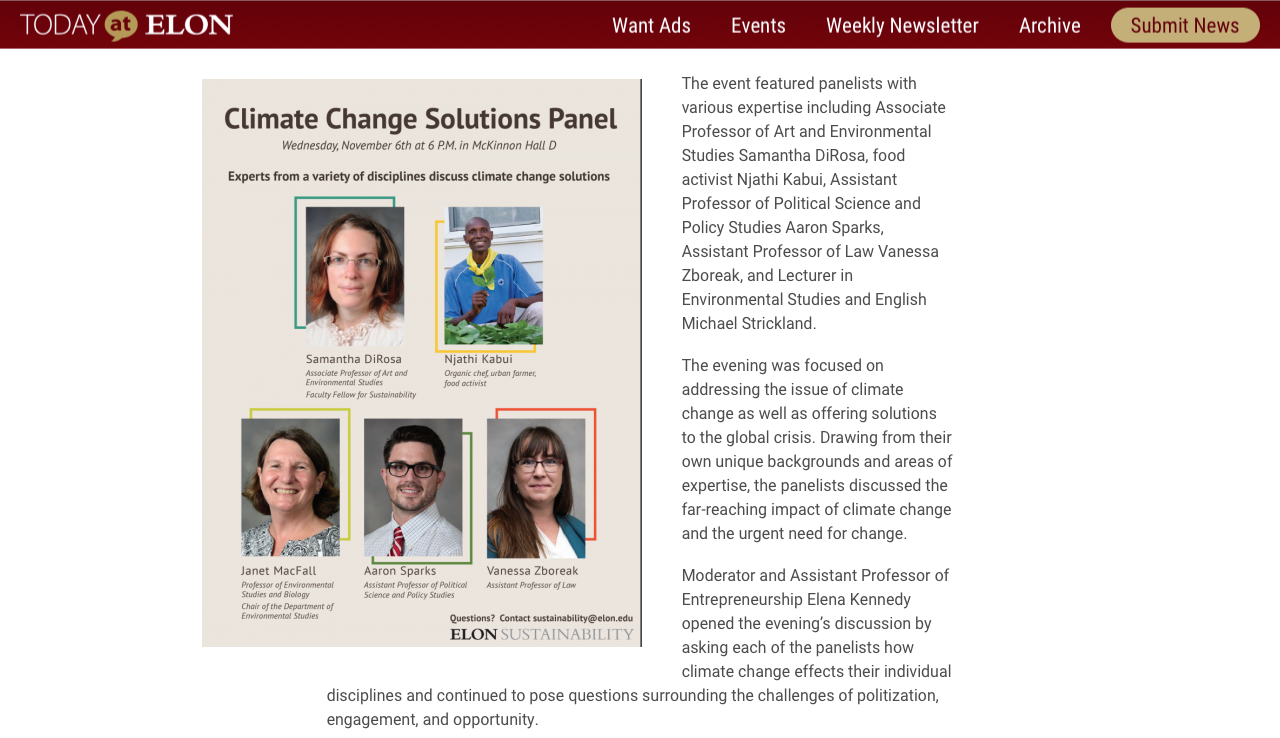
Here is the article as it is shown on the website. Informative yet concise writing on a topic that is, well, topical.
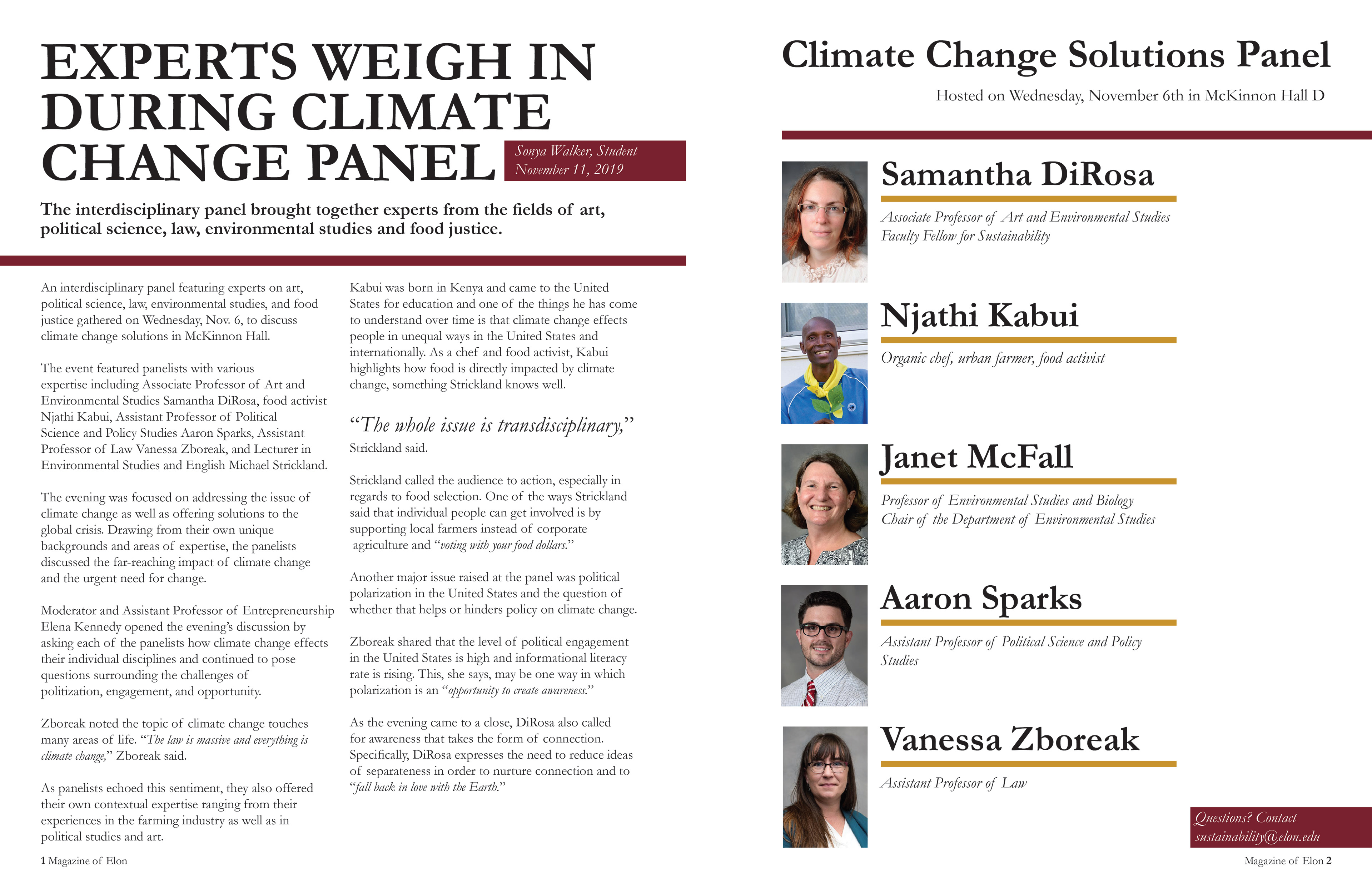
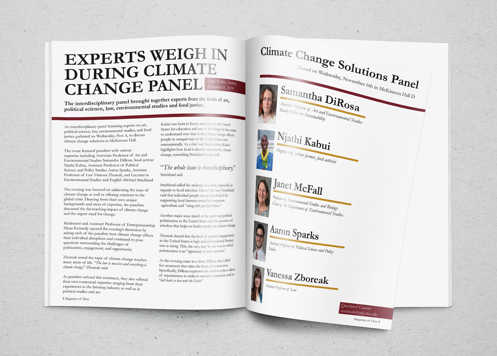
And here is my interpretation of how it would look in a magazine spread. I went with a two column grid to organize the text because I believe the subject to be fairly important. Personally I am not a fan of articles having hyphenated words through out the text, so I designed the paragraphs to get rid of them. Also I did a simple callout of the quote "The whole issue is transdisciplinary" not only because is it a powerful quote, it very much is the main theme of the article to begin with.
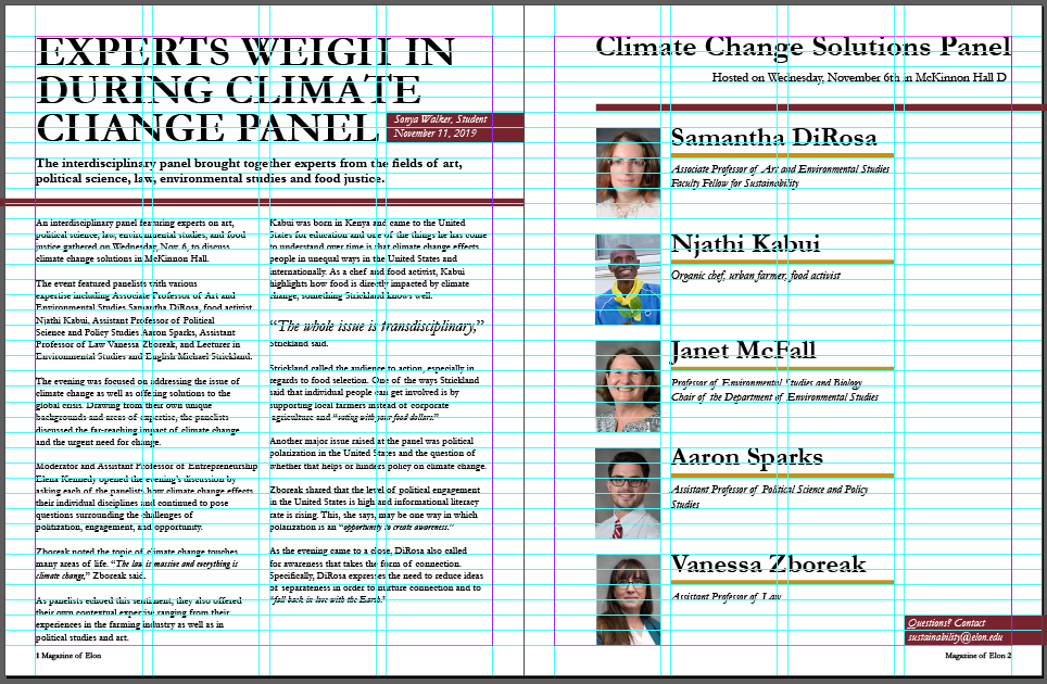
I also want to show off the grid that I used to organize the information. A pretty simple 4 column 40 row grid worked well enough to get the point across in my opinion.
And finally, who doesn't like a good clean mockup to present design?
Over all I am pretty happy with how this came out learned surprisingly a lot about the process of magazine design.