When I joined My Nerdy Web Guy in May, it was in the plan to give the small, one man company a graphical refresh. Anthony wanted to take his business to the next level, and that meant that his next logo had to reflect that change.

If I'm not mistaken, I believe that this logo was a commission from someone on Fiverr, where the description was "Harry Potter mixed with Geek Squad". Not terrible, but could be a lot better. Now that I was working for Anthony, I had to create something where I would not only think that the logo is awesome, but that also makes me excited to work. Surely this would be an easy task
(spoiler: it wasn't)
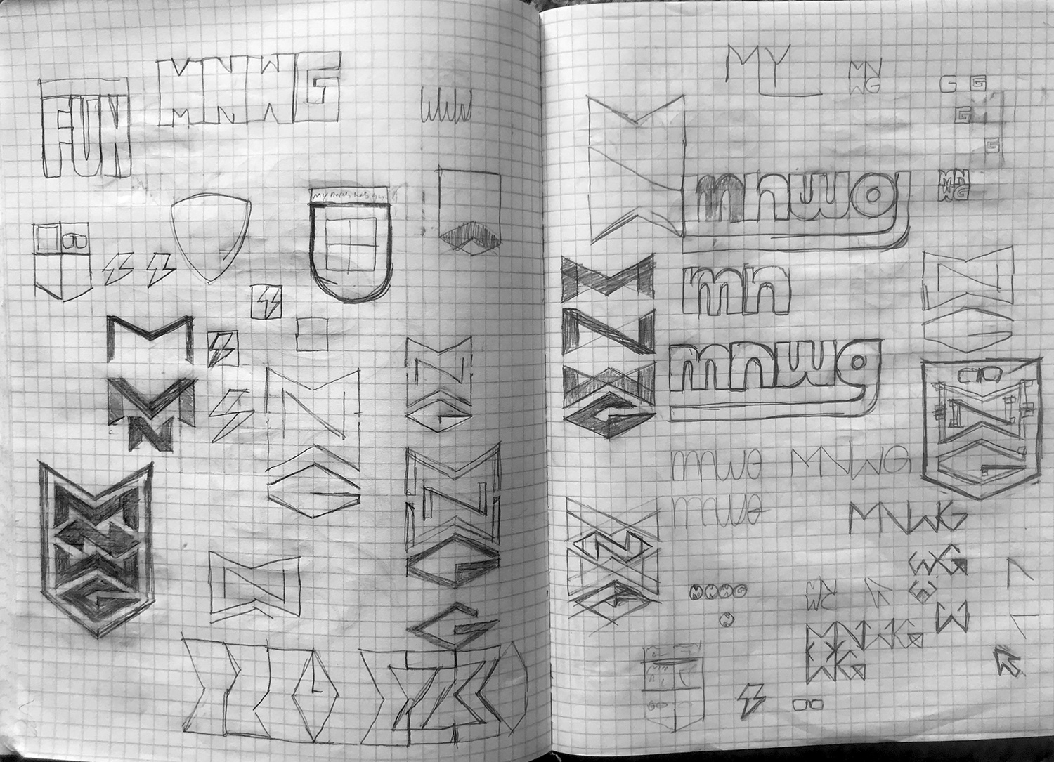


These are just a few of the pages that I chose to show the thought process. Initially my plan was to just reduce the name down to first letters, however I realized that it would ultimately hurt the brand if people didn't even know what the letters stood for in the first place. Just because IBM did it doesn't mean we could.
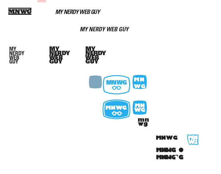


After drawing out as many ideas as I could, then went to Adobe Illustrator to see if I could kick something else up. Towards the end you can see where I re-introduce the full name, as well as figure out a cool little idea with the tie being a part of the computer mouse. (I ended up ditching the mouse idea altogether, but held on to that tie shape.)
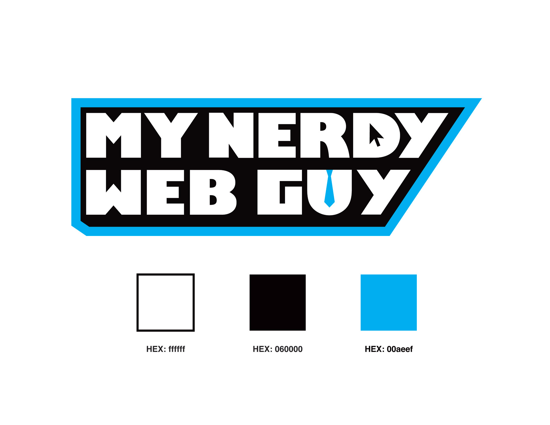


Here is the final result. Simple and sleek, yet exciting and bold. We were both very excited by this version, especially the little details in the D and the U. Plus, using 100% Cyan in contrast with Black and White, brings us that professional feeling, while being vibrant at the same time.